B2B landing redesign &
system migration
B2B · UX/UI · Product Design · 2023
Redesign of a partner program site for an international fintech platform, focused on conversion, scalability, and localization. I led UX planning, visual design, and Webflow implementation across 10+ markets, with custom components, responsive layouts, and internal design guides.
The Challenge
The original partner program page was unclear and outdated.
It struggled to convert visitors into active partners due to:
❌ fragmented structure
❌ lack of localized support
❌ confusing content hierarchy
❌ weak visual trust signals
Internal teams also had difficulty maintaining or updating the site, which slowed down campaigns and limited growth across markets.
Project Goals
✅ Improve user understanding of partner benefits
✅ Increase conversion from visit to registration
✅ Support multilingual rollout (RTL, local currencies)
✅ Build modular structure for scalable future updates
✅ Enable marketing team to manage site with minimal dev input
My Approach
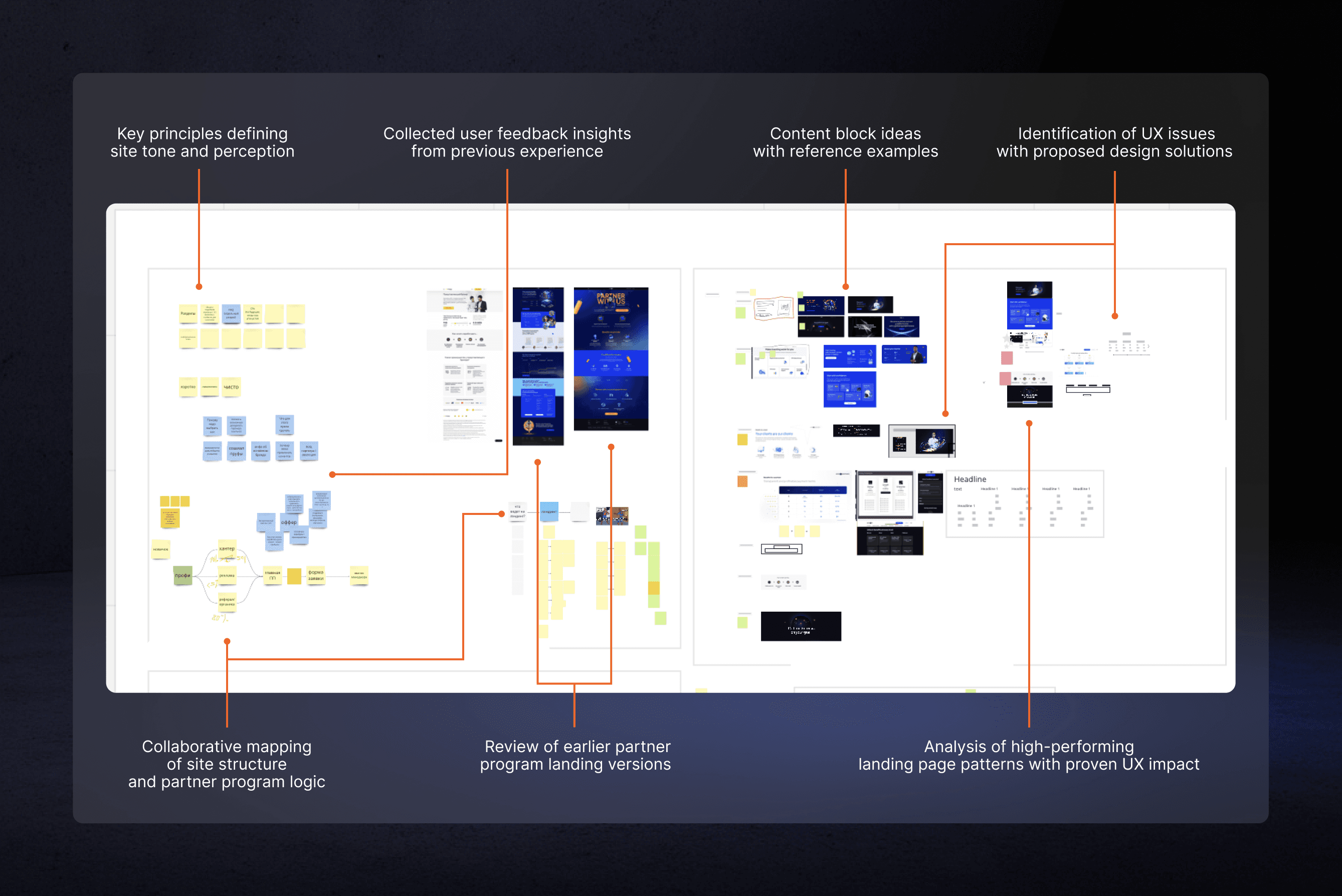
I worked closely with PMs and developers to define the ideal partner journey, map user flows, and restructure content.
I introduced UX principles into a previously visual-first workflow — focusing on information hierarchy, localization support, and component-based layout logic.
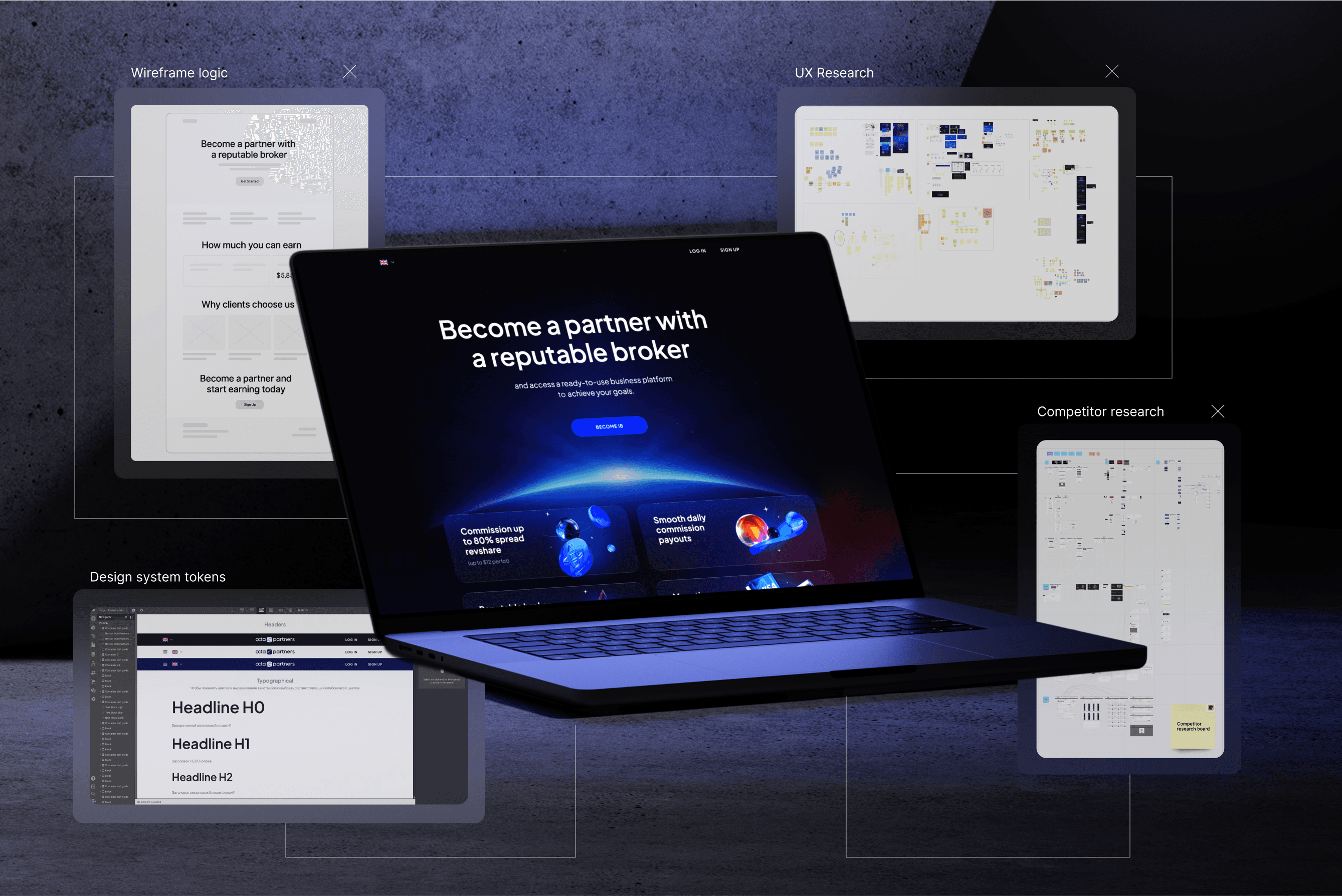
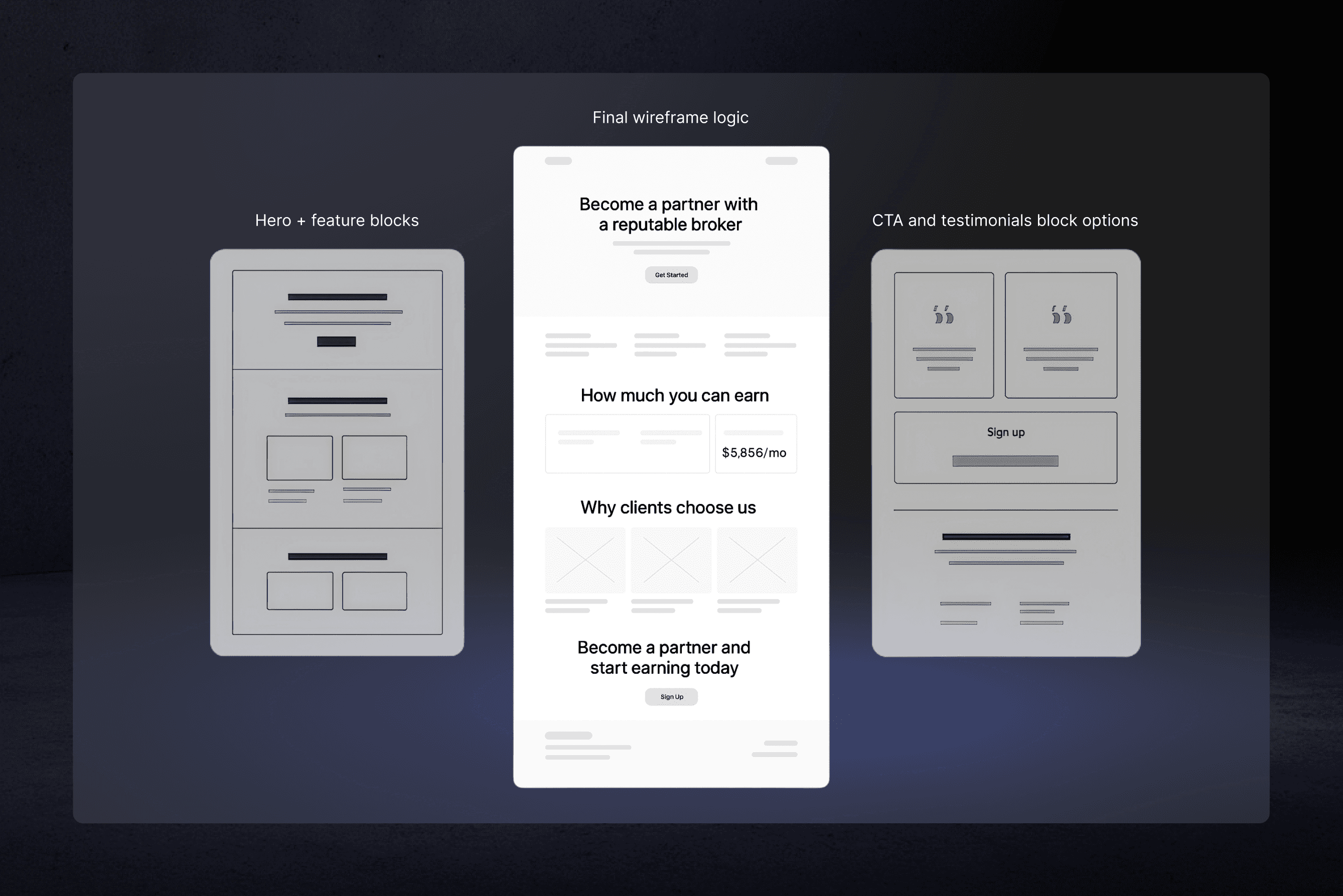
UX Structure & Wireframes
We mapped out the new page structure to support clarity, localization, and scalability.
I created wireframes with a modular layout focused on key UX priorities:
Value clarity
Conversion flow
Trust blocks
Registration path
These became the foundation for component-based design and future content flexibility.
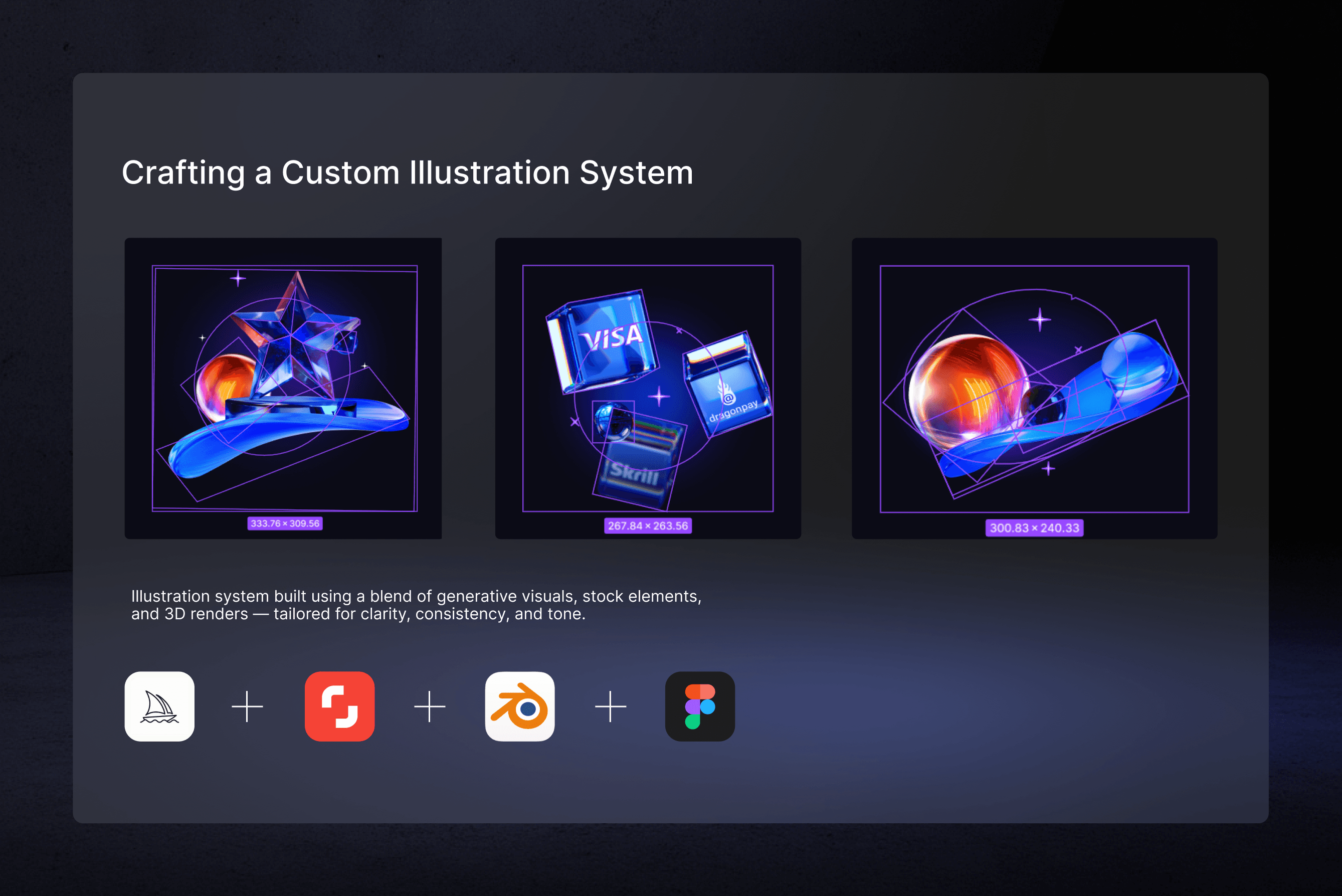
UI Design & Visual System
I translated the wireframes into a clean, conversion-focused UI system — aligned with brand tone, trust goals, and multilingual requirements. The layout uses a modular structure, custom 3D illustrations, and Webflow components for consistency across pages and regions.
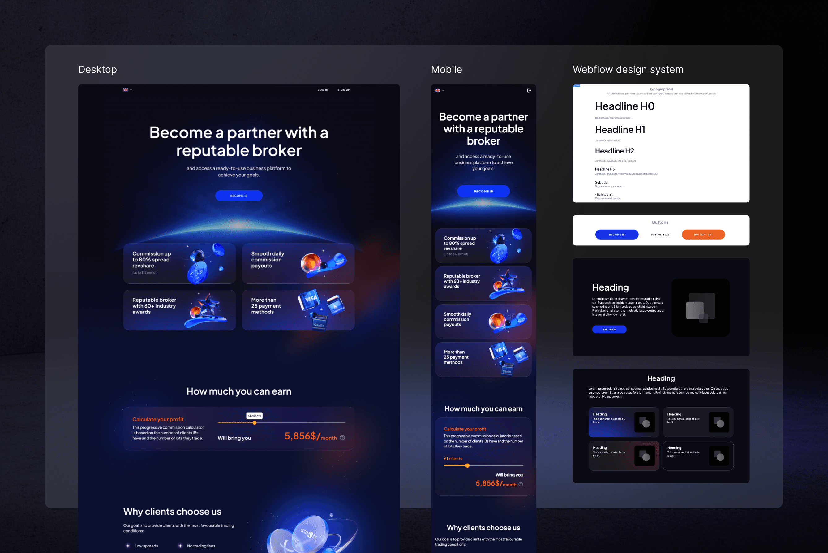
The illustration style was chosen to support a futuristic, tech-forward tone — aligning with the financial domain and the platform’s international reach.
I worked within the brand’s primary color palette (deep indigo, electric blue, accent orange) to ensure consistency across the landing, UI components, and visuals.
All visuals were tuned for clarity, recognizability, and seamless integration with dark backgrounds.
Impact & Takeaways
3× increase in partner registrations in the first quarter
Localized rollouts across 10+ regions and languages
Faster marketing campaigns thanks to reusable Webflow components
What I Learned
Leading end-to-end UX/UI across live product environments
Designing scalable systems with modular logic
Communicating design rationale across product, dev, and marketing teams
The site has been live since 2023 with minimal updates.